branding
branding
commerce
commerce
Kakiwi - Modern greengrocer
Kakiwi - Modern greengrocer
Kakiwi - Modern greengrocer

About project
About project
About project
Kakiwi – A Juicy, Joyful Brand for a parisian greengrocer
Kakiwi – A Juicy, Joyful Brand for a parisian greengrocer
Kakiwi – A Juicy, Joyful Brand for a parisian greengrocer
Kakiwi was a vibrant branding project for a local fruit and vegetable shop based in Paris, with a mission to bring color, freshness, and friendliness to the neighborhood shopping experience. The goal was simple: create a playful and distinctive identity that reflects the natural abundance of a fresh produce stand, while standing out in a crowded urban landscape.
As the lead designer on the project, I developed the entire visual universe of the brand, including the logo, color palette, typography, patterns, and printed materials. The result was a bold and cheerful identity that celebrated seasonality, freshness, and the everyday joy of fruits and veggies.
Client

Problem
Problem
Problem
Many small grocery and produce shops suffer from bland or generic visual identities, making it difficult to build a memorable presence or emotional connection with customers. Kakiwi needed a brand that would spark curiosity at first glance and reflect the energy of a produce market in full swing, while staying grounded in values of quality, approachability, and community.
The challenge was to strike the right balance between playfulness and clarity: the identity needed to be fun and expressive, but also legible and adaptable across signage, packaging, social media, and printed materials.
Solution
Solution
Solution
I built a joyful, modular, and expressive brand system rooted in freshness, roundness, and color:
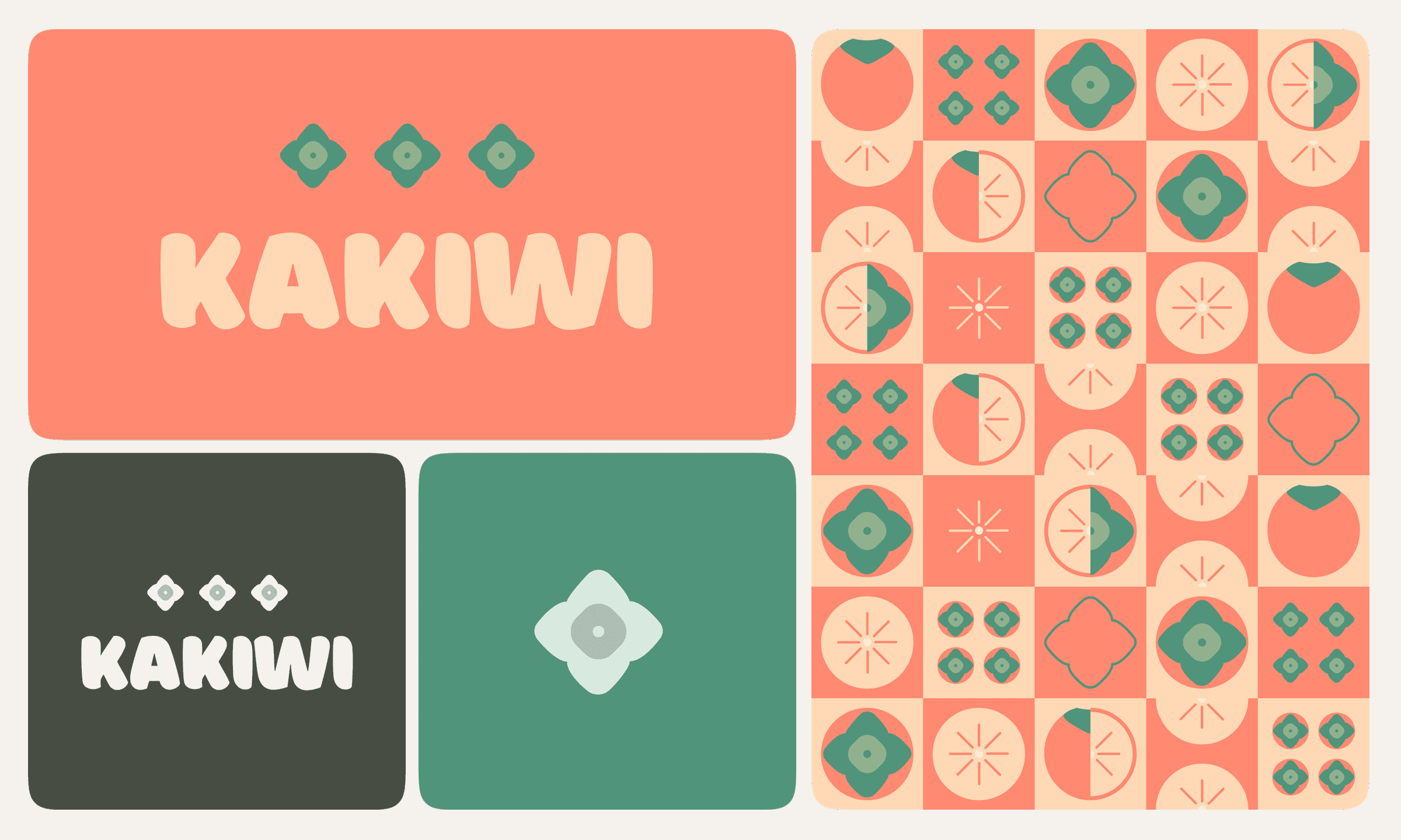
Logo Design: I created a playful logotype with rounded shapes and a soft structure, echoing the organic curves of fruit and nature. The name “Kakiwi” itself inspired a sense of rhythm and fun, which I leaned into with the typography.
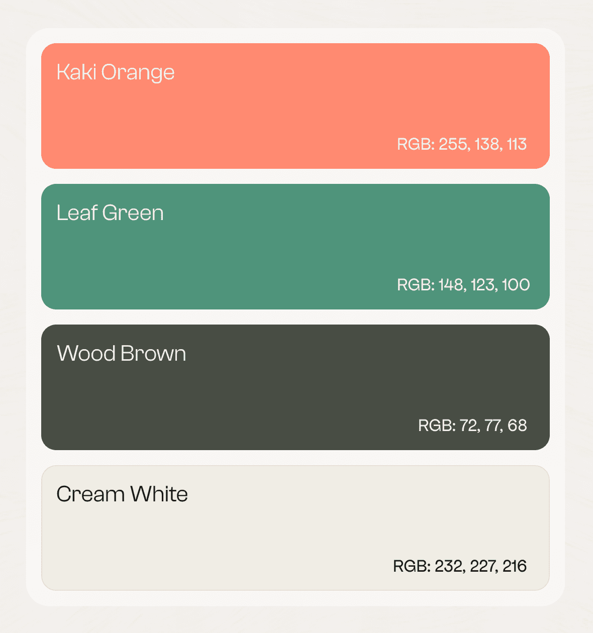
Color Palette: I developed a bold, fruity color system inspired by produce—sunny oranges, leafy greens, berry pinks—designed to feel both delicious and energizing. The palette was carefully balanced to ensure contrast and flexibility across mediums.
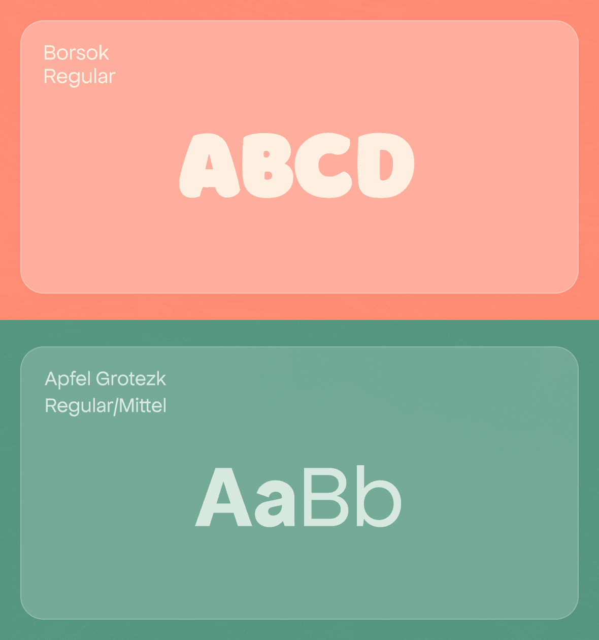
Typography: The chosen typefaces are friendly, approachable, and highly legible, perfect for everything from storefront signage to small labels and printed bags.
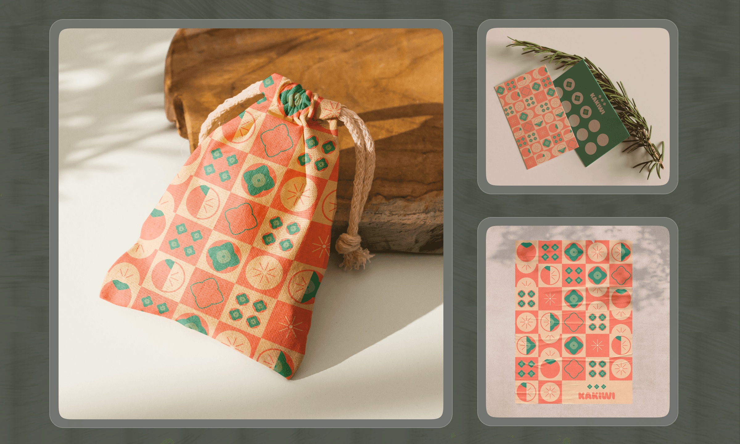
Custom Patterns & Graphics: I designed a set of bespoke illustrations and organic patterns based on fruit shapes and rounded forms. These visual elements gave the brand an instantly recognizable texture and a sense of movement, perfect for wrapping paper, stickers, and reusable totes.
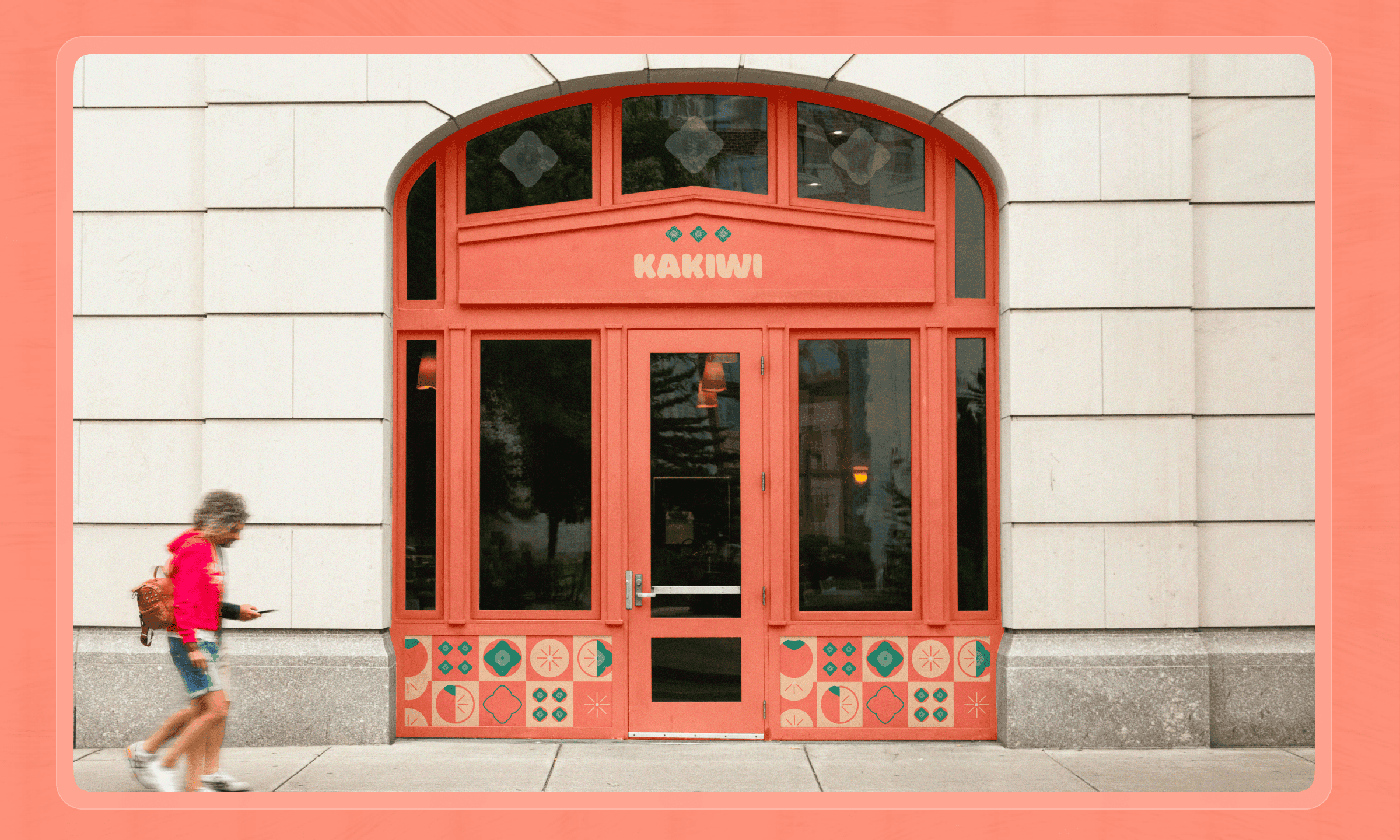
Merch & Print: The visual system was extended to print materials and merchandise, including flyers, paper bags, and promotional items—ensuring the brand could live both inside and outside the store.
I built a joyful, modular, and expressive brand system rooted in freshness, roundness, and color:
Logo Design: I created a playful logotype with rounded shapes and a soft structure, echoing the organic curves of fruit and nature. The name “Kakiwi” itself inspired a sense of rhythm and fun, which I leaned into with the typography.
Color Palette: I developed a bold, fruity color system inspired by produce—sunny oranges, leafy greens, berry pinks—designed to feel both delicious and energizing. The palette was carefully balanced to ensure contrast and flexibility across mediums.
Typography: The chosen typefaces are friendly, approachable, and highly legible, perfect for everything from storefront signage to small labels and printed bags.
Custom Patterns & Graphics: I designed a set of bespoke illustrations and organic patterns based on fruit shapes and rounded forms. These visual elements gave the brand an instantly recognizable texture and a sense of movement, perfect for wrapping paper, stickers, and reusable totes.
Merch & Print: The visual system was extended to print materials and merchandise, including flyers, paper bags, and promotional items—ensuring the brand could live both inside and outside the store.
In conclusion
In conclusion
In conclusion
Kakiwi’s identity is a celebration of nature, color, and community. The brand brings a refreshing and joyful tone to the everyday act of buying fresh produce, inviting customers to reconnect with simplicity and flavor through a strong visual experience.
This project highlights how a well-crafted visual identity can transform a small business, turning it into a neighborhood landmark and a source of everyday delight.
Have a project in mind?
Enough scrolling, let’s build something together.
Better email?
Have a project in mind?
Enough scrolling, let’s build something together.
Better email?
Have a project in mind?
Enough scrolling, let’s build something together.
Better email?
All rights reserved. ©2025 by
Dylan De Oliveira
All rights reserved. ©2025 by
Dylan De Oliveira
All rights reserved. ©2025 by Dylan De Oliveira